Data Visualization
The Sprout Space classroom project is an example of a complex building design problem. It has multiple objectives and a large number of alternatives. We have now generated the performance data, but how to strike the best balance in energy use, daylight and view quality? This section describes how to use a parallel coordinates plot to assemble and visualize this information, and begin to understand and make trade-offs.
Resources
| Resource | Description | Weblink | |
|---|---|---|---|
| Data | Sprout Space Data Spreadsheet | Open | |
| PCP | Sprout Space Parallel Coordinates Plot | Open | |
| GH file | Sprout Space GH Definition | Download | |
| Flux | Flux plugin for Grasshopper | Download |
Parallel Coordinates Plot (PCP)
The basis for use of PCP is to represent multi-dimensional numerical data sets (Kosara 2010). In its most basic sense, the technique conveys information as a data table. The data set integrates and associate parameters or characteristics that have a relationship. In the use for building energy modeling, the work relates the significant attributes and their correlation with a set of inputs and outputs. The inputs in the Sprout Space building model can be geometrical such as window width, the offset of classrooms, orientation, roof angle and overhang length. The outputs for the project provide an understanding for how the inputs affect the building model in terms of total thermal energy, cooling load, heating load, daylight factor, direct line of sight and view quality. The parallel coordinates plot displays and maps each variable for every design alternative relating to the building model geometry, energy, daylight, line of sight and view quality for the project.
Visualizing the Design Space
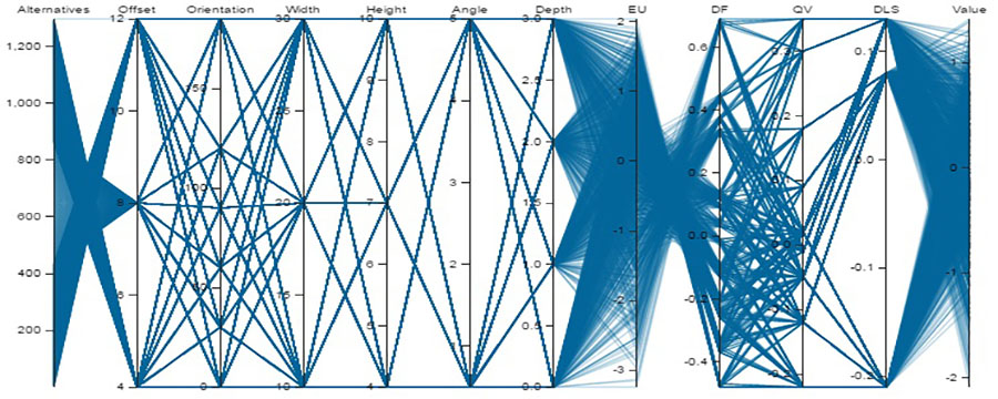
The plot strategy visually connects the relation of each row of data to adjacent data point column and scaled vertical axis with a line element (Figure 6.1). The notion of contours for the strategy is a valid description for the way the related information maps to a particular row of data from the original source which is data defined by columns and rows. The chart type provides an independent scale of values for each variable. The plot typology visually connects the relation of each row of data to particular characteristics using the contour line notation.
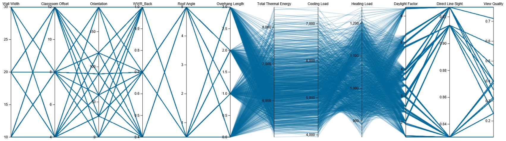

Figure 6.1: PCP of the entire Design Space of 1296 alternatives
Filtering the Design Space
The parallel coordinates plot provides a process for discerning patterns between the vertical scale and parameters. Decoding a parallel coordinates chart entails a strategy for pattern recognition through the use of a filter technique that isolates and simplifies the display. For such as purpose, by interactively selecting an interval of any coordinate, the Design Space is reduced to the set of alternatives that match the new threshold of values (Figure 6.2). The effort helps to reduce the large amount of information into a smaller number of values and relationships. PCP are essentially a pattern graph technique for substantial amounts of data analysis. The chart type can prove useful in the discerning and addressing the optimization of a multi-objective design problem.
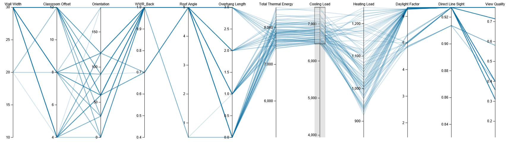
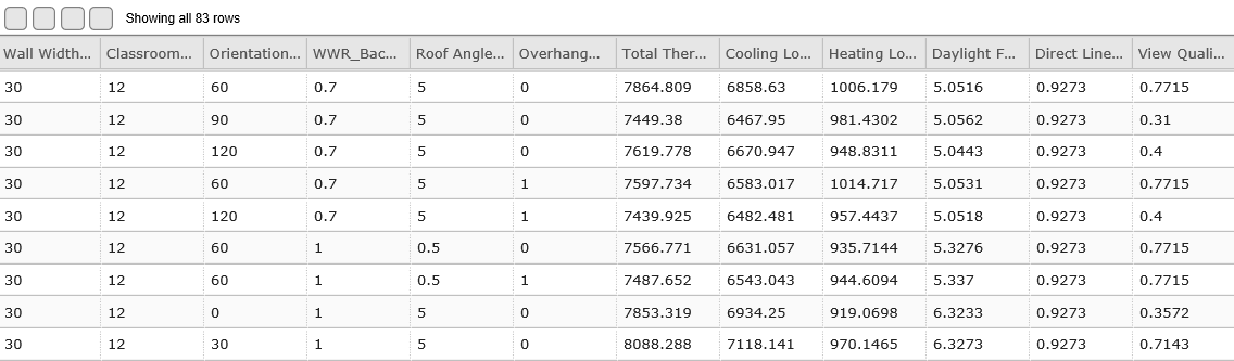
Figure 6.2: Interactive filtering 83 alternatives based on of cooling loads
Visualizing a Single Alternative
Beside the filtering features, the custom PCP also interactively allows the visualization of single alternatives by rolling over the data table (Figure 6.3). This operation facilitates visualizing the chosen alternative in the context of the entire Design Space for preliminary assessments.
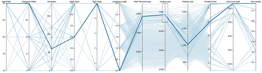
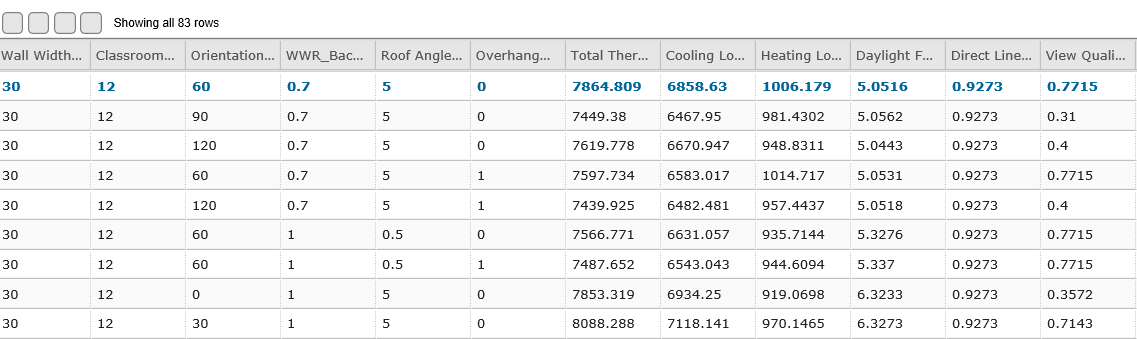
Figure 6.3: Visualization of a single design alternative
Excel Data Export
Several components are involved in the sequence of recording the inputs parameters options and the outputs indicators of the multi-criteria analysis process (Figure 6.4a). This section records and writes the data in an Excel spreadsheet after every iteration. The resulting data can be later directly copied to a Google online documents to facilitate visualization.
 Figure 6.4a: Excel Data collection process
Record
The Merge component creates a list with the results of the Current Run. The Rec or Data Recorder component adds it to a larger list that collects the results of Multiple Runs.
List
The Partition component takes in the list of multiple runs, cuts it in chunks - in this case of 22 values consistent with the number of variables listed in the Heading list- and creates the list with the Lists of Runs.
Write
Finally, the ExcelWrite component takes the Heading list as first row, the Lists of Runs in column form, flips it into rows, and records the data in a predefined spreadsheet specified by the Spreadsheet File Path input component. While the Write toggle execute the writing process, the Clear one offers the option of accumulate data if ti is False or re-clear and write each time if it is True.
Flux Data Export
This section records and writes the data to Flux (Figure 6.4b). It records and lists similar than the Excel based data collection process presented above.
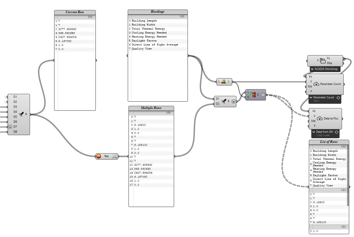 Figure 6.4b: Flux Data collection process
Write
The three Flux components output the data to keys in a Flux project. We will cover how to setup the Flux project in the next section. The upper Flux component lets you choose which of your Flux projects the data will be output to and pulls the list of keys in that project. Once you have setup the Flux project (see next section) you will need to set this node to 'ACADIA 2016 - Workshop 6 - Design Space Construction'. The two To Flux components take the list of keys from the Flux project and the data to send. The black tab below the component lets you select which key you want the data sent to. Again, once the Flux project has been set up the upper node will need to be set to the 'Parameter Count' key and the lower to the 'Data from GH' key. When the input values going into the To Flux component change the tab turns green. To send the data to Flux press the 'refresh' icon on the right hand side of the tab. (Figure 6.5)
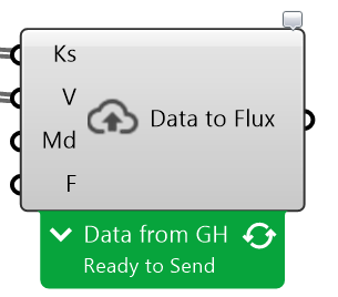
Figure 6.5: Send Data to Flux
The Parameter Count component sends the number of parameters per run to the 'Parameter Count' Flux key to be used in data formatting in the Flux flow. The Data to Flux component sends the Lists of Runs data to the 'Data from GH' Flux Key.
Flux
Flux collects the data being output from the Grasshopper definition, formats it into a table and send that table to a Google Doc spreadsheet. You should have received an email from Flux prompting you to create a Flux account. If you didn't you will need to go to Flux.io to create one. It's free and easy. Once you have an account, follow this link to create your Flux project based on a Template Project that has been created for this workflow (https://flux.io/template/acadia2016-workshop). It will be named 'ACADIA 2016 - Workshop 6 - Design Space Construction'. (Figure 6.6)

Figure 6.6: The Flux Project
The advantage of using a template project, as opposed to starting a new blank project, is that the flow, which takes the raw data from Grasshopper and formats it into a table for Google Docs, is already created. (Figure 6.7) Once you've added the project you don't need to adjust the flow.

Figure 6.7: The completed flow
Google Docs Data Spreadsheet
The PCP uses a publicly shared Google documents spreadsheet as input file that collects the data of the simulations. This information will append to the P+W PCP engine to visualize the chart based on its unique identification number. It can collect the information from Excel by manually copying the data. or from Flux as explained in the following sections.
Getting Data from Flux
Install the Flux for Google Sheets (Beta) plugin (https://chrome.google.com/webstore/detail/flux-beta/jligldjpandgfdicfggcmhcpkaihcijf?utm_source=permalink). Once installed you can open the Flux plugin by opening Google Sheets and going to Add-ons -> Flux (Beta) -> Open Flux. A window may pop up asking you to sign in to your Flux account. Do so. After signing in a sidebar will appear on the right hand side of the Google Sheets window. Click on the 'Receive from Flux' down arrow. Then press the '+ Add a connection' button. (Figure 6.8)

Figure 6.8: The 'Receive Data' panel in Google Docs
Use the following settings: (Figure 6.9) Cell to position data: select the entire sheet Flux project: 'ACADIA 2016 - Workshop 6 - Design Space Construction' Load data from: 'Data Output to Google Docs' Press the 'Save' button.
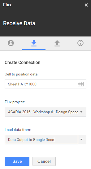
Figure 6.9: Connection settings
You should now see the 'Data Output to Google Docs' connection. Press the 'Refresh' button to load data from Flux into your spreadsheet. (Figure 6.10)
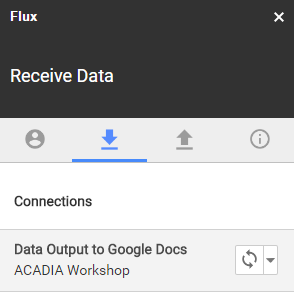
Figure 6.10: Completed Flux data connection
Shared Public Document
Figures from 6.11 to 6.15 show the process that creates the required public document to transfer the data of the multiple runs. The link must be public, visible by anyone, and not sign-in required. These setting enable the P+W PCP engine read and visualize the spreadsheet data.

Figure 6.11: Shareable link
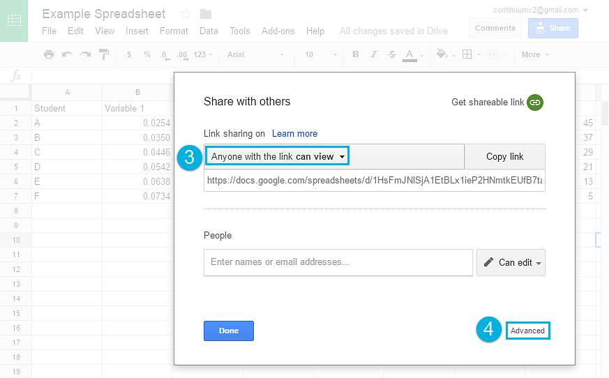
Figure 6.12: Setting public visibility of the link
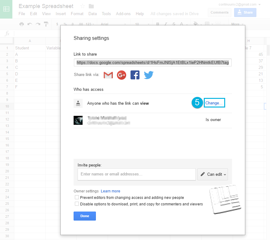
Figure 6.13: Specifying the access restrictions
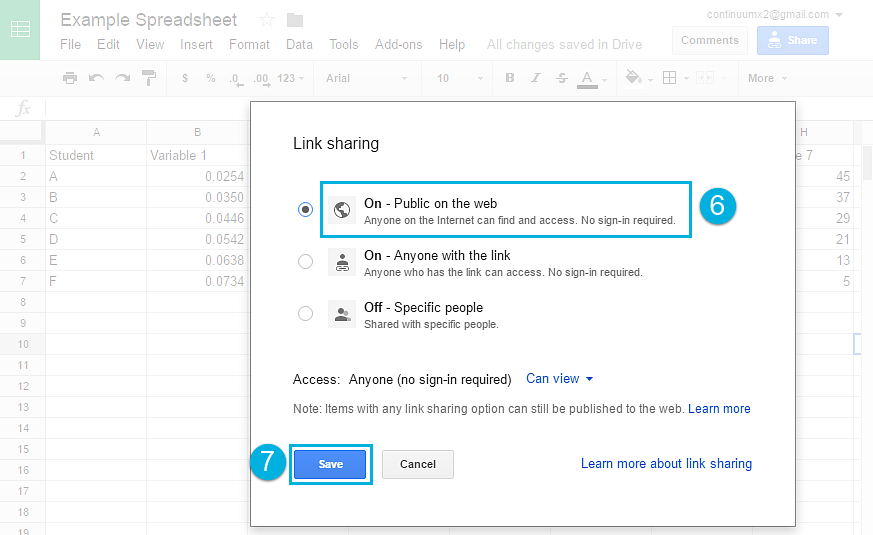
Figure 6.14: Going public on the web, not sign-in required

Figure 6.15: Accepting all the changes
Spreadsheet id and sheet name
The identification number of the shared for public use spreadsheet can be found within Google document similarly to the Figure 6.16.
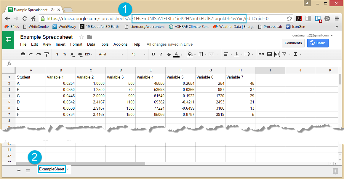
Figure 6.16: Google Spreadsheet ID and Sheet Name
Visualizing Custom Data from the Spreadsheet
The custom PCP chart contains a feature that can selectively display a certain range of data and columns found in the spreadsheet (Figure 6.17) that contains the data from the 1296 runs of the Sprout Space design alternatives. It collects inputs parameters and the performance indicators.
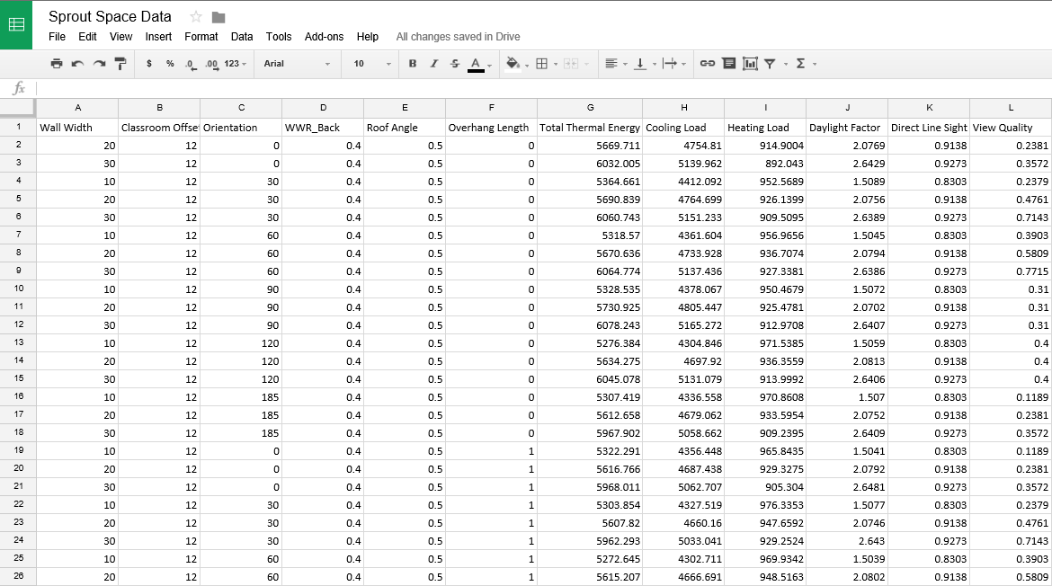 Figure 6.17: Sprout Space spreadsheet
Spreadsheet Link
The complete Sprout Space spreadsheet with selected and complete data can be found here.
https://docs.google.com/spreadsheets/d/1BSXqMQtfUeK6XzOhss9a8B9iVGh26YxAY2hZkahACYk/edit?pli=1#gid=0
P+W PCP
Address of the P+W custom PCP engine
http://maps.perkinswill.com/dsc/PCP.html?
Spreadsheet Id
Sprout Space spreadsheet unique ID
id=1BSXqMQtfUeK6XzOhss9a8B9iVGh26YxAY2hZkahACYk
Selection of Columns
The code below expresses the sheet name for the spreadsheet and the range of column of data to plot. After the spreadsheet id, this code appends the connector '&', the variable 'range', the name of the sheet 'ExampleSheet' (if a sheet name has a 'space' in it, the 'space' must be represented with text as '%20'), the '!' exclamation point that separates the sheet name and column span represented as 'A:L' that will plot columns 'A' to 'L'.
&range=ExampleSheet!A:L
Sprout Space PCP
The example below shows a html address of the PCP chart with the appended id of the spreadsheet with the Sprout Space alternatives and the range of columns to visualize. The resulting PCP can be found here.
http://maps.perkinswill.com/dsc/PCP.html?id=1BSXqMQtfUeK6XzOhss9a8B9iVGh26YxAY2hZkahACYk&range=ExampleSheet!A:L